
Los Angeles County Fair
Client Overview
Los Angeles County Fair (LACF) is your classic county fair – just bigger. It’s an annual 19-day event in September where over 1 million friends and family go to enjoy carnival rides, eat crazy food, shop at vendor booths, and watch concerts and performances.
With an event this huge, ticket sales can get messy.
The Ask
Reduce crowded ticket lines at the door and increase overall ticket sales by increasing advance online ticket sales.
The Solution
Facilitate online ticket sales by improving the ticket checkout experience.
Questions to kick start my process
Who are the users?
What are current issues with the website and ticket checkout?
What opportunities are there to improve the user’s experience?
To answer these questions…
Research
Heuristic evaluation: I explored the site, identifying and categorizing possible pain points of the user

Online research: I learned about LACF’s users by looking up LACF’s demographics
Interviews: I interviewed several people who have attended LACF or similar fairs

Image source: fairplex.com
Usability tests: I gave several volunteers a scenario and task to perform on the LACF website (“You and a group of three other friends decided to go to the fair this Friday. You’re in charge of buying tickets. Purchase the tickets online along with anything else you might want to buy in advance.”)
I used other research techniques along the way, including:
- Created user journey map
- Performed a card sort of all ~50 site pages to restructure the site map
- Analyzed Yelp user reviews of LACF
Our user
To represent characteristics of people who attend LACF, I created a persona based on demographic and behavioral information from my research.

I decided on a user flow, also based on situations I heard from my user interviews. What is Joyce trying to accomplish?
Joyce and a group of three other friends decided to go to the fair this Friday. Joyce is in charge of buying tickets. She wants to purchase the tickets online along with anything else she might want to buy in advance for convenience.
Problems
What makes this task frustrating for Joyce and might even keep her from completing the task?

Click image to enlarge
Joyce runs into navigation issues trying to search for information relevant to groups since she’s attending with a group of friends, then she becomes irritated by the ticket purchase process itself.
Improving site navigation
Most users I interviewed attended fairs with a group – friends or family. I noticed LACF has some accommodations for groups, but relevant pages were scattered under three separate menus and labeled with “mystery meat” titles like “Party Boxes”.

Original website with group-relevant pages mysteriously titled and spread across three separate menus.
Even though few options were relevant to small groups and families, it was just as important for users to quickly know those options were NOT relevant so they don’t waste time digging through menus and pages wondering what they might have missed.
I double-checked my suspicions with a usability test. Given a scenario and task, my user hesitated a lot and wasn’t sure whether he identified pages that might be relevant to his group outing to the fair.
My solution
- I put all relevant pages on a single page under a new menu item, titled “Groups”.
- This new “Groups” page had the pages listed on cards with descriptions so users can get an overview without clicking into the page.
- Each card also displayed the minimum group size so users don’t visit the page just to find out it doesn’t apply to their own group.

Navigation – BEFORE

Navigation AFTER, with “Groups” page
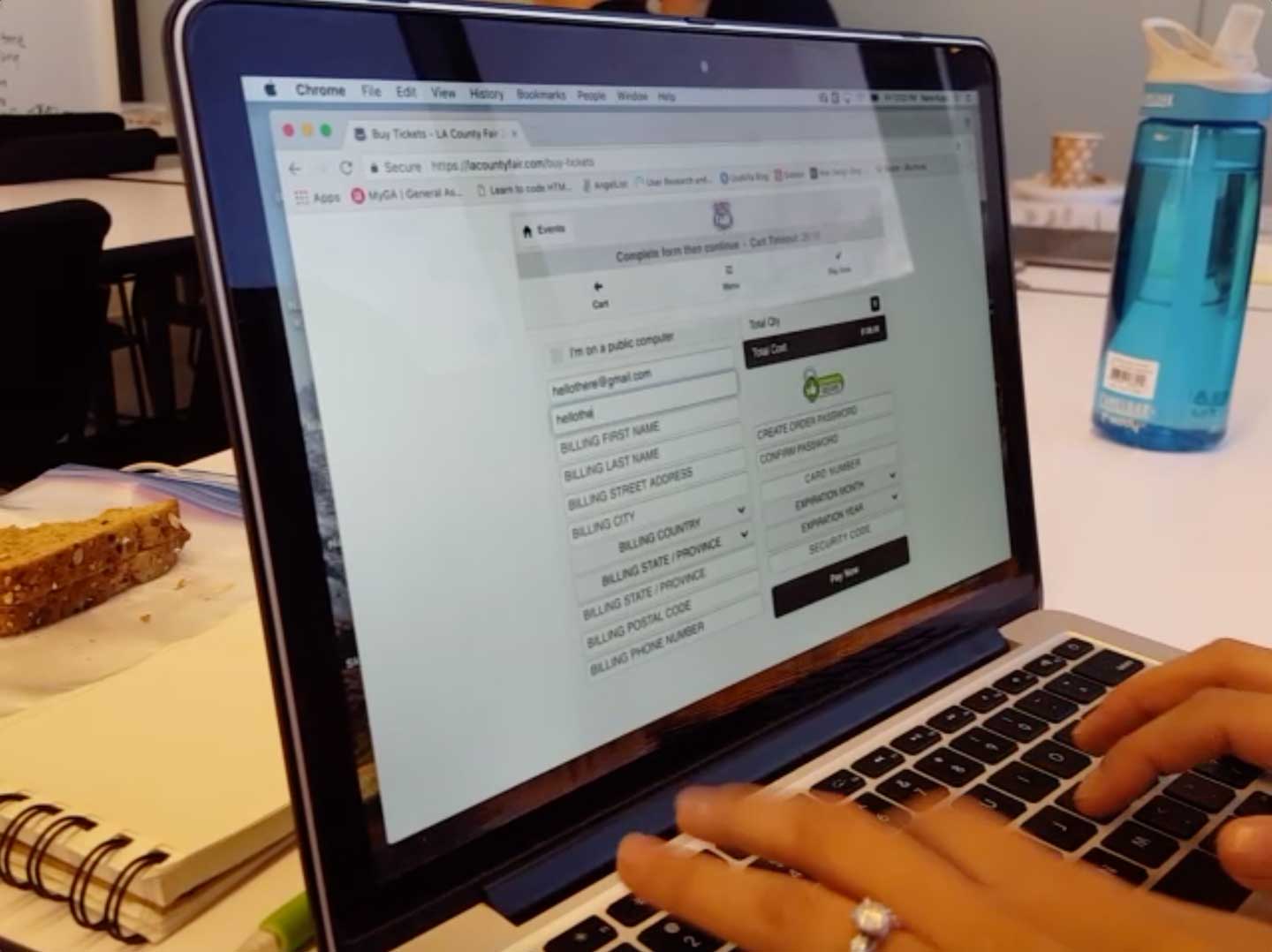
Improving ticket purchase flow
When users were given a scenario and a task to purchase tickets on the LACF website, they got confused and frustrated at several points. I anticipated several of these points of friction from my heuristic evaluation, and I verified these friction points as well as discovered new ones through performing 4 usability tests.


I addressed these simpler issues by following established convention and best practices for forms and other standard e-commerce elements.
The main challenge
My biggest challenge was handling the nuance of the two types of general admission tickets sold by LACF – “Single Day Admission” vs “Weekday Admission”. One can be used on weekdays only, while the other can be used on both weekdays AND weekends (AND costs over 40% or $6 more) – a pretty simple difference, but just complex enough that it would be incorrect to simply label them “Weekday Admission” and “Weekend Admission”.

In my usability tests, 1 out of the 4 users was confused by the two types of tickets sold by LACF and 2 out of the 4 users actually purchased the option that was excessive for their situation. This means the user needlessly spent ~40% more, possibly to realize this later and regret it, or possibly face upset friends or family members if the user is buying tickets on others’ behalf.
Also, I was surprised when seasoned event goers in my usability tests asked “Wait… do Fridays count as weekends?”, explaining that some event sales do consider Fridays as weekends.
How do I help the user feel confident in their selection?
Design
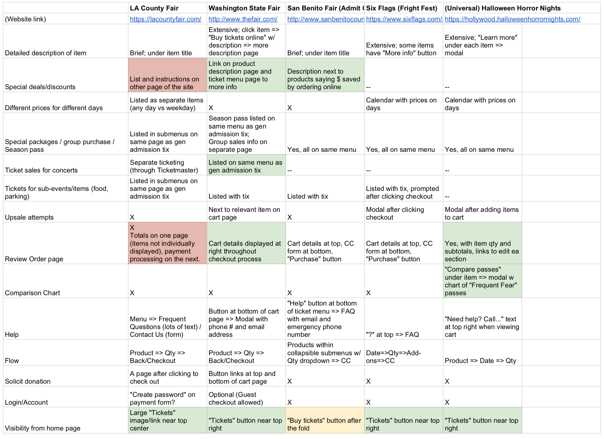
Comparative Analysis
To figure out how I might display complex ticket options, I asked “How are others currently doing this?” I set out to compare LACF’s ticket purchase flow with that of other large county fairs, but there was a hiccup – being late September, almost all other county fairs were over and their ticket sales were disabled. As an alternative, I found comparisons for ticket sales with the complexity I was looking for – multi-day sales with different ticket types and packages. I found these characteristics in local amusement park ticket sales and seasonal Halloween special events (ex: Six Flags Fright Fest).
Options
Based on my comparative analysis and some brainstorming, I considered the following options/features to help our users confidently select the right ticket for them:
- Step-by-step/page-by-page based on the user’s situation – For example, “Do you plan to go on a weekend or weekday?” A longer process, but some people prefer being guided – it works for tax filing software! (But are we filing taxes here?)
- Calendar – Display a calendar and post the ticket price for each day. Easy-to-use, but doesn’t help the user understand the difference between the two ticket types, plus ticket prices aren’t based on just the day – it also depends on if the ticket is for an adult, child, or senior.
- Accordion menu – Like “step-by-step”, this shows the user just what’s relevant to them, plus no need to “go back”.
- Comparison table – Allows users to compare details, but possibly visually overwhelming. And honestly, not very sexy.
First Solution Attempt
Instead of showing them all the options, why not just guide them toward the one that’s right for them? I wanted to try the guided step-by-step approach but make it easy to “go back”, so I thought I could achieve that using accordion menus. And honestly – they’re so dynamic and sexy! I wireframed the concept in Sketch and printed those out as paper prototypes.

I performed usability test on two users… enough to tell me it wasn’t working. Among a handful of smaller issues, the biggest problem with the accordion menus was both users ended up expanding every menu anyway because even though they could identify which product was right for them, they were curious about the costs of the other options.
Insights
I discovered from accordion menu usability testing that users wanted to compare their ticket options. Even if I tried to give them just the info they needed, they wanted to see the other info. Furthermore, one user felt other options were being hidden – he valued transparency. So how can I help them compare their options?
Results
I went back to my options and decided to try the most transparent option that puts it all out there, yet organizes and facilitates understanding of the information – the comparison table.

A couple cycles of paper prototypes and usability tests later…

I did a few more usability tests with this final design. Although the user would pause a bit at the comparison table, all 3 out of 3 users made the ticket purchase most appropriate for their situation without signs of confusion or frustration and no signs of other previous pain points.
Visual Design
For 2018, LACF’s theme was Route 66.
I felt LACF’s design implemented the theme very thoroughly, but was over-the-top in a distracting way and clashed in some places. For these reasons but also to practice my visual design skills, I attempted a visual redesign following the same branding.

Route 66 mood board
Using my mood board, I condensed these visuals down into one idea: The open road.
I also wanted to challenge myself to preserve some of the “carnival” feel of loud and fun that the original design exuded, but being careful not to become obnoxious or cause accessibility issues.
LACF website with “open road” visual design concept. (Logo is theirs.)
Try Prototype
(Scenario: You are going to the fair this Friday with 3 other friends. Buy tickets and parking – all four of you are taking one car.)
Prototype is using new responsive design that’s currently being usability tested.
Conclusion
Although it wasn’t possible to get data on how my redesign affects ticket sales (being that this is spec work), final usability tests show that users find it easier, less frustrating, and less confusing to buy tickets online than before – promising factors for increasing online sales.
Presenting my redesign to classmates. (After my first presentation to my class, I thought to record future presentations for my own improvement. That’s the original purpose of this video.)
Retrospective
Takeaways
The better solution is found and validated through testing – and the winner might not be the sexier solution.
Next Steps
A responsive version of the ticket checkout is crucial, since about 50% of web traffic is mobile, and it’s likely the user might think of purchasing a ticket when not in front of their computer, possibly even when arriving at the fair and seeing a long ticket line at the door. (Update: I designed a responsive version that is undergoing usability testing. You can take a sneak peak by clicking “Try Prototype” above, before the Conclusion.)

Screenshots of mobile responsive version (click image to enlarge)
See next case study: SideChef App