Background
Finli is a fintech startup. One of our products is a mobile app for parents to crowdfund for their childcare expenses (with the ability to also just pay those bills themselves through the app). We made a pivot to market toward small business childcare providers – we provide them a billing and payment platform (in the form of an enterprise web app), and they collect their customer payments through our mobile app.
Objective
Design any modifications needed on the mobile app to accommodate for the new “enterprise”-associated parents.
My Role
Solo designer (amid three developers and a project manager)
Purpose and priorities
The onboarding for “enterprise” parents introduced external complexities – accounts needed to be created on the app side as well as the enterprise side, and then these accounts had to be linked via the parent entering a code received through email, and finally the parent waits for their bill to be issued from the small business. There were many touch points outside the app and a point where the user needs to know to just wait.
My objective was not only to have the user simply complete the required steps, but to make sure the user was confident in what they were doing and felt reassured upon completion that they were successful in their task and knew what to expect next.
Considering other stakeholders
The company wanted to launch the new enterprise platform within a month. To accommodate for this, I basically designed options with varying implementation time for developers. I presented the pros and cons and we collectively made decisions before I moved on to design higher fidelity versions.
My take on the onboarding
The previous design presented the old onboarding tasks in a slide show that appeared only once to a new user. Because the new tasks are too crucial to rely on just front-loading the info and hoping the users memorize them, I leveraged displaying the tasks on the home page, which users see frequently.
One design I created was to have “cards” that each contain an onboarding task. Depending on which tasks the user has completed (they weren’t necessarily sequential), only the relevant cards were displayed. Implementing the logic in that solution and doing the front-end development for the cards would take considerable time.
My “band-aid” design was to have one card displaying all the tasks, with no interactivity, and simpler logic governing whether that card is displayed (display until all tasks are completed). I presented the options and collectively we decided the second option was the better fit considering our resources.
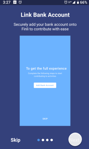
Before: Onboarding tasks and information were presented through a slideshow – this mean we were relying on the user’s memory to make sure potentially crucial tasks were completed.
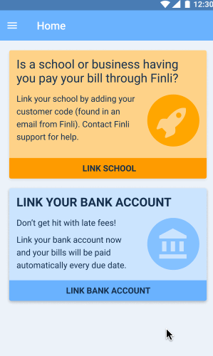
After: Instead of a tour that the user ever sees just once, the user now sees critical tasks sitting on the home page until they have been completed. Only relevant information is displayed as needed.

After (alternative): Behold… the “cruddy” version! We don’t all have time to implement the designs we want, so I created a version that adopts the same strategy but requires considerably less development time (implementing the conditional logic as well as visual design).
Results
At the time this case study was written, we had onboarded only a large handful of parents. Several parents were actually onboarded before the new home page was implemented and we did receive questions from a couple parents asking whether they did things correctly. Ultimately, the team chose the “quick-to-implement” version of the home page and it went live. A couple parents onboarded after the new home page went live and one parent reported being pleased that the process was easy (the other parent didn’t mention anything but did successfully complete the required steps without intervention).